The Computer Revolution Hasn’t Happened Yet

Alan C. Kay, redraws our perspective in this small introduction to the computer revolution. He points out every important, mayor shift instance, where the printing press was being adopted. The long stretches of time that it took for humans to develop more innovative technologies and ways of thinking. I want to hope that Moore’s law is also taking part in our advancement in computer literacy. I wonder what the comparative ratio between the literacy rate was at the cusp of the printing press. Would this equate to the number of programmers today? First, Kay makes an excellent point that in a way refutes his comparison to the printing press, why are we still thinking of the computer as a new form of printing press?

During the video talk, he points out that there are 2 ways of looking at new technologies, as far of possibilities: to automate the old  or to leverage the new. The printing press-computer analogy is the prefect reference to this process. Do we continue to see the computer as an automated printing press, or what are the  new things a computer brings that should be leveraged?

Kay is interested in designing for the future, creating programs that with time recreate a better version of themselves, metaprogramming.  This is somehow possible with Object Oriented Programming, but I don’t think I understand entirely. OOP is defining objects by classes that contain methods and variables, but these objects have contained methods that are unreachable by other methods in the program. Like Kay’s cell wall analogy, the object is the membrane that encapsulates all the internal methods that are particular to that class, and keeps away all the others, maintaining it’s objective integrity. These are a few examples of programming Object Oriented Programming (Pure: Smalltalk, Ruby/ OO+Procedural Languages: C++, Java, Python/ Mainly Procedural Languages: Perl, Visual Basic, PHP), Prototype-based Programming(JavaScript) , Dynamic Programming (Python, Ruby) and Functional Programming (Processing).


Permanent link to this article: http://interface2011.coin-operated.com/2011/09/the-computer-revolution-hasnt-happened-yet/

Maker Faire !!!!!

Phone Charging Mailbox

One of the first interfaces that caught my eye was in the radio shake area. They reused a mailroom mailbox set and turned it into a cell phone charging area. People can plug their phone in, lock the door, and leave without worrying about their phone. People always have problems with their phones dying, especially at events like this because they are taking pictures and contacting people.


Tiny TVs and Video Games!

I am extremely interesting in presenting my video work on tiny screens. The Microsoft booth had small electronic gadgets, including this tiny TV and speaker set. When a video is presented in a smaller format the viewer is forced to come closer and have a more personal interaction with the layout.


Mics made from Bottle caps

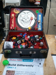
These are mics made from bottle/beer caps. They work really well with different vibrations rather then picking up sounds. It has an AUX input, so you can plug it into a speaker through that. One of the examples the guy used when demoing the product was a slinky.


Sable, Naomi, and I came across a non-profit booth where they wanted you to build a tower out of old CD cases. We stayed and helped for about 30 mins. Even though we were just stacking and taping these cases together it created an interesting conversation. These were items we used to cherish growing up, the music of the CDs that had been donated, the different designs, etc.


At the Harvestworks (<3) booth Liz Taylor had a set up of paper circuitry. I’ve heard of soft circuit but I didn’t know you could do it with paper and metal paint. When I got home I went onto her blog to see what she has been doing with it. It’s so fascinating! I want to try to work on some for my last project!


Permanent link to this article: http://interface2011.coin-operated.com/2011/09/maker-faire-5/

Commentary on the passage “Design of everyday things” by Donald Norman

I believe the main point made by Donal Norman in this passage dealt with “Intuitiveness”. He breaks open the notion of products and interfaces being “Intuitive” and puts it in the context of everyday use of objects.

A very important remark made in the passage which was kind of an undertone, was the priority of aesthetics and usability in design. In many cases, the final product the author had experienced interacting with, or was quoting others having interacted with it, were beautifully designed, to the point where they had even won awards; and yet failed to fulfill the only reason they were designed and manufactured in the first place.

In my opinion, the notion of design should not solely imply a mere “facelift” for the product. Design should also focus on the “behavior” of the product in a way that it will be intuitive enough for users, possibly in some cases regardless of their cultural or social contexts. The example of Paris subway, illustrated a convention adopted by the Parisian in their social context, that failed strangers to be able to operate the car door.

I believe the more complex the systems become, the more the length the designer should go to construct a thorough conceptual model. In my opinion, prototyping in this context can be seen as an extension of conceptual model; which in a way allows the designer to “think through” the interactions before handing out the final design to the manufacturer.

Interaction, visual and audio feedback and affordance -in my opinion- are not novel concept. If we refer to our past experience and memories, we clearly can relive the memories of touching a thorn, blocking our eyes from the sunlight or strumming a guitar or piano. If we look closely, we can find traces of feedback, affordance, constraints and even mapping (which string or key produces which note) in all of them. And I believe  Since a great deal of our knowledge of the world around us comes from our previous physical interactions and experiences with the world surrounding us, it would be wise to incorporate those experiences to design a more “Intuitive” product. After all, that is where the notion of “Intuitiveness” comes from.

As for the “Switches” dilemma, I believe taking the interaction between the user and the lights to “Higher Level” might be an efficient solution; That is, instead of having the users deal with “What bulb”, we can have them deal with “Where to light up”. More practically put, we can provide the users with a touchscreen LCD that has the plan of the room embedded, so that the users can point to certain areas they want lit, and control the amount of light, and let the processor deal with what bulb to light up, and how much. Of course, the above scenario would seem logical in a large scale conference room, as opposed to a small living room.

To sum up, I believe the “design of everyday things” should rely greatly on human cognitive psychology and the study of behavioral patterns, decreasing new “learning” inputs to minimum, and taking advantage of the overall perception of the physical world already known to an average user.


Permanent link to this article: http://interface2011.coin-operated.com/2011/09/commentary-on-the-passage-design-of-everyday-things-by-donald-norman/

Maker Faire 3

Singing Car

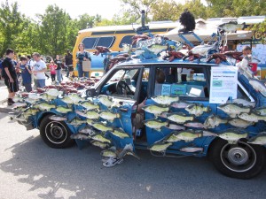
This was a project that immediately grabbed my attention and I just had to put it on here.  It is taking the traditional interface of an object we use everyday and putting a spin on it, changing its purpose. I thought it was a good example of how we can start thinking about objects being used in ways different than our preconceived notions of them.  The only issue I have with this is what purpose can it serve? Right now it seems that it is purely for entertainment, but maybe we can possibly get something else out of it.  I think it is more of the concept that I appreciated, which was taking an object we use everyday and shedding a new perspective on it.  This is definitely a tactic we should always keep in mind as designers.


Permanent link to this article: http://interface2011.coin-operated.com/2011/09/maker-faire-3-2/

Maker Faire 2

Vertical Theory

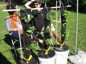
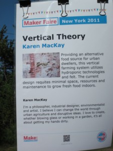
Another project I was not surprisingly intrigued by was vertical farming.  Coming from a landscape architecture background, vertical farming was an idea that would constantly pop up time and time again. There will come a point in time where this will be absolutely necessary – with the growing human population food is becoming less available. Vertical farming takes up virtually no additional space, as it can be implemented on high rise buildings in NYC for instance. In this case they used a Hydroponic technique with  a clay base and water, which requires no soil.  Vertical farming would solve several issues that come along with farming- there would be no fossil fuels due to tractors and plows, no weather related crop issues, it would slow down global warming by allowing forests to grow back where they were cut down for farms, and minimize conflict over natural resources such as water.  I appreciate this project because it is a practical solution to a real world issue, and one that I believe will soon be necessary in the future.

Permanent link to this article: http://interface2011.coin-operated.com/2011/09/maker-faire-2-2/

Maker Faire 1

Handy Chair

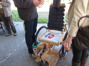
I found these to be interesting interfaces because the purpose is to create safe, functional, low-cost vehicles to promote wheelchair user dependence. There was a sign that said something like, “we will all end up in a wheelchair someday,” which I do not necessarily agree with but the fact is many people do.  Customizing these to suit our own needs could help get away from the negative connotation associated with wheelchairs by undermining user dependency on others.  I especially like this because it is practical and is atempting to solve a real-world issue, which is my goal as a designer. I believe design should have a purpose and work towards improving lives in some way.

Permanent link to this article: http://interface2011.coin-operated.com/2011/09/maker-faire-1/

7 in 7: Day 6: Lips

This idea has be bubbling in my head for sometime now. I gave myself a two hour time constraint, sadly I did not finish the video due to renderings :-C BUT I think i’m off to a good start.

In this video I’m exploring more of sex and technology. What it means to be a women during this time when we have internet personalities.


http://vimeo.com/29265244

Permanent link to this article: http://interface2011.coin-operated.com/2011/09/7-in-7-day-6-lips/

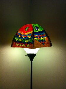
7in7 # 3 Fish Lamp-chimney

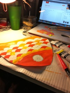
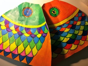
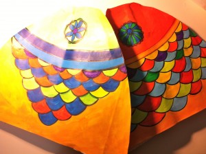
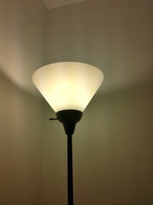
This is a fish lamp-chimney. And this is an accident.

At first, I did not think this project can be a lamp-chimney. I tried to make a fish face hat for taking photos. Still pretend to be a fish( Waring the fish face hat) in crowd. What is the difference between you and others? You are a fish, you do not touch the ground, as you do not touch the ground in water. You float most time.

Here is the example my friend and I took before —- floating in air, do not touch the ground. Just jump, pretend to be floating.


BUT, at last, I gave up the idea since the fish hat is so stupid, and when people jumped with it, it always flied off out control.

Ok, this is a new project with the fish face hat. Nevertheless, now it is a lamp-chimney.

Drawing and making steps:


Hope you like it~


Permanent link to this article: http://interface2011.coin-operated.com/2011/09/7in7-3-fish-lamp-chimney/

Reading Commentary Week #3: The Psychology of Everyday Things

I really enjoyed reading this.  As I’ve always been in search of what does it mean to design something and what’s the real difference between good vs bad design.

It was wonderful to read his assessment on how doors and switches are actually badly designed at times.  Because in his observation, when there needs to be a visual aide or some kind of an instruction (i.e. push, pull, on, off), the design is flawed.  Just a lot of excellent observations on the most simple things around us are actually badly designed.

I’d also like to add to that the cultural aspect of some of these (badly designed) things get even more complicated.  Cultural differences and practices has an impact.  Different countries have different ways of doing things.  So yes I did relate to his example of the subway doors in Paris.  I don’t think it’s badly designed, it was just something I wasn’t used to.  It took a few seconds for me to realize I had to physically open those doors because I saw how the handle would turn.  Also I couldn’t figure out how to flush the toilet inside the Air France plane.  It took me several minutes to figure out it’s just a button which was on the side against a wall, that I mistook for some kind of a light function.  Again, it wasn’t badly designed, it was just not something I’m accustomed to.  Meanwhile, we have a lever here in the states.

Japan was probably the worst, because there was a gadget for everything.  There was a switch for opening the blinds, turning on the television, how to dim the lights and control the temperature.  They had instructions, but when you’re fighting jetlag and can’t find the English version on the little tiny booklet amongst seven languages, you tend to give up.  But  I’ve been washing my hand with shaving cream which I thought was soap, because well, it was in this ulra modern liquid soap canister and it was right next to the sink.   So instinctively, I thought it was soap.  One would think.

I do agree, certain things that look simple do get complicated or overly designed.  And when you are not accustomed to a lot of things, it just gets even worst, but not because it was badly design, sometimes it’s just user error.

Permanent link to this article: http://interface2011.coin-operated.com/2011/09/reading-commentary-week-3-the-psychology-of-everyday-things/

Day 6: 7-in-7

recording1

Day 6: Sound

I continued with my theme of mapping, and since my day mostly consisted of maker faire I decided to capture the sounds that I heard there as my mapping project for this day. This is something unconventional for me since I have never really played around with sound before, and it took a lot of getting used to. I decided to use the program Audacity to piece my sound clips together, although I think it may still sound a bit rough. The weird quirky sound piece I got out of this day sort of sums up the uniqueness and craziness seen in the range of projects there. It was a fun experiment for me.

Permanent link to this article: http://interface2011.coin-operated.com/2011/09/day-6-7-in-7/