Instruction Sets For Public- DAY 2 + 3 (Continued)
After our first test, we realized that we needed something obtrusive to capture the public’s attention, enough to garner questions and hopefully participation.
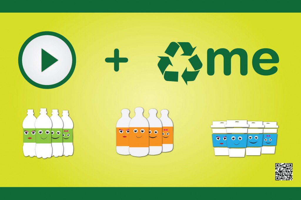
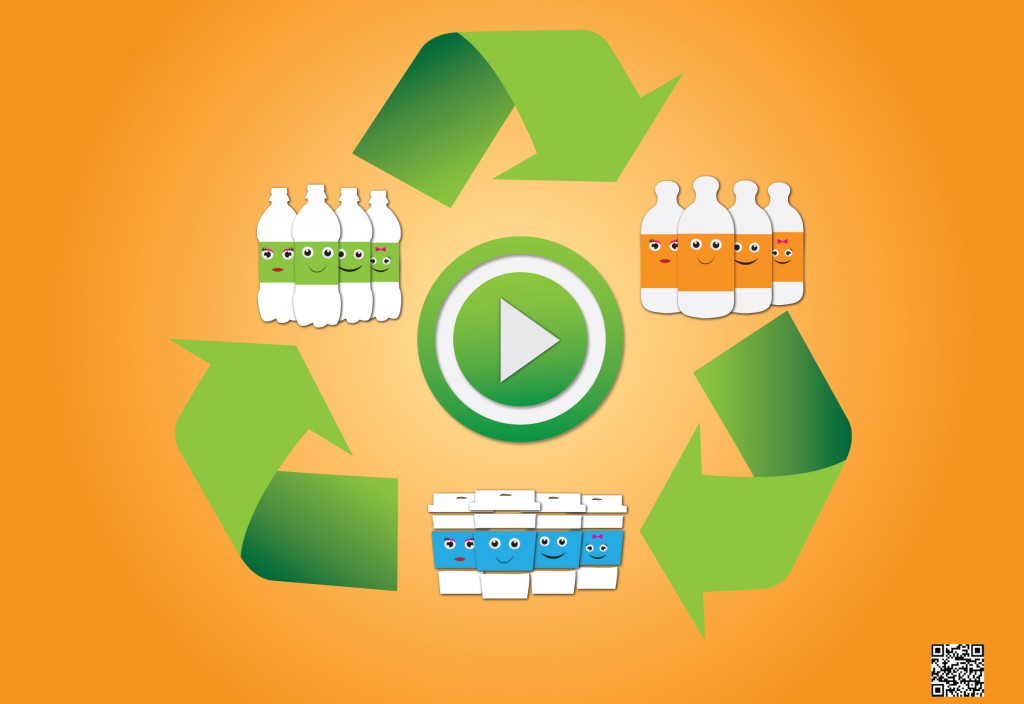
What we came up with are two billboards/posterboards around 32X24. We designed it with bright colors in an attempt for it to stand out:
Billboard A:

Billboard B:

OBSERVATION:
-Here’s our video… HD version will be presented in person-
watch?v=wIwf9lf6IE8
watch?v=F9QlU30AydQ
CONCLUSION SO FAR:
(will be discussed in depth in class)
1) Not a lot of children as we’d hoped.
2) Weather was a factor.
3) Those who participated had some feedback (i.e. prefer a linear/one direction search instead of sporadic).
4) Maintenance/Highline crew will throw anything away despite the “cute friendly” factor.
5) Recyclable + Scavenger hunt was lost in translation with visiting foreigners.
6) Only tech-savvy individuals understand QR codes.
7) More to add…
Hazel M. Bala
Well let's see... I graduated from NYU w/ a BA in French Language and International Politics. Because of the French, I became an account executive in the fashion industry. Being a corporate yuppie didn't really sit well with me after awhile. So I switched careers and retrained as a Graphic Designer/Art Director building up my print portfolio (I wanted to pay attention to my creative side).
Now in my 30s, I want to evolve into something more progressive along the lines of new media (i.e. interaction, web and motion). I've handled huge accounts, dealt with "captain of industry" types, and managed a staff. At this point, I want to focus on me and what I truly want to become professionally. I'm a lot more mature and honest with myself this time around. And I think I have more to offer artistically and intellectually than I had in the past.
Permanent link to this article: http://interface2011.coin-operated.com/2011/11/instruction-sets-for-public-day-2-3-continued/


Comments!