Americana Interface Design- Website
FINAL PROJECT SUMMARY + RECAP:
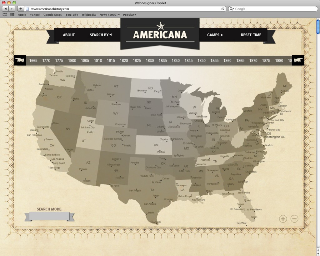
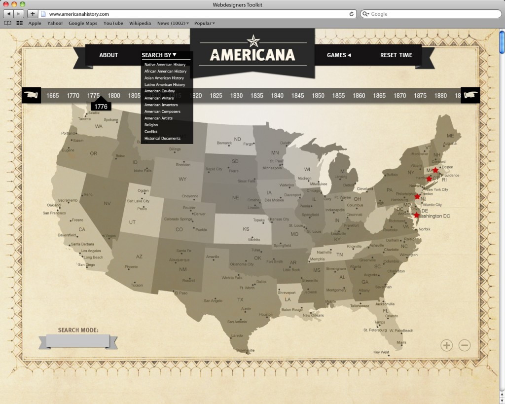
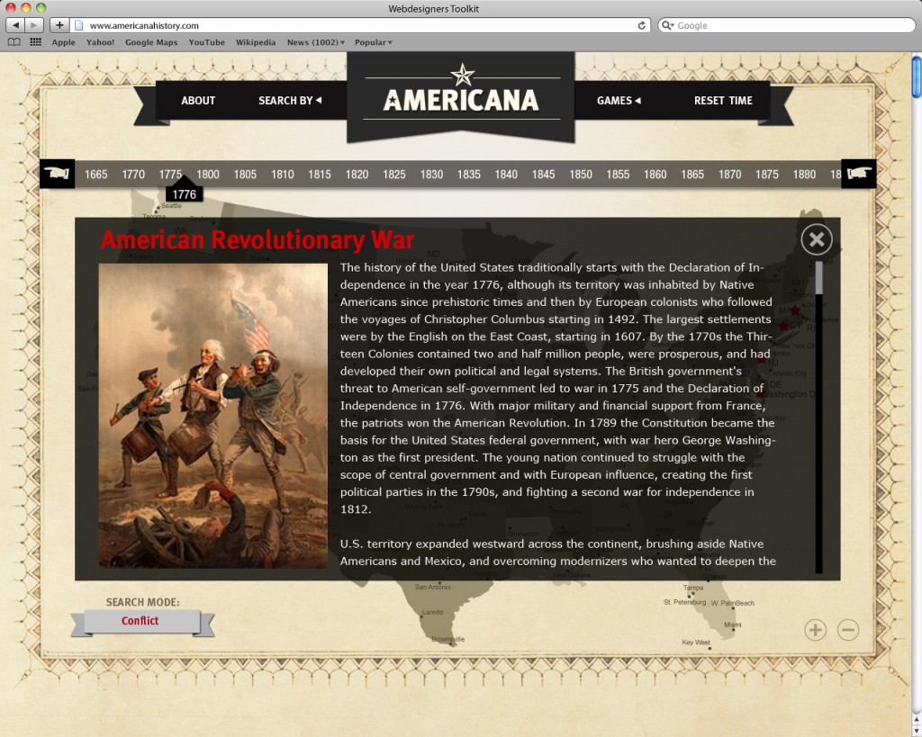
– This whole project concept was to develop/design a website + website app in order to learn U.S. History. It’s meant to be a convenient educational tool and resource.
WHAT DO YOU HOPE TO PROVE:
– American History is interesting and important
WHY IS THIS DIFFERENT:
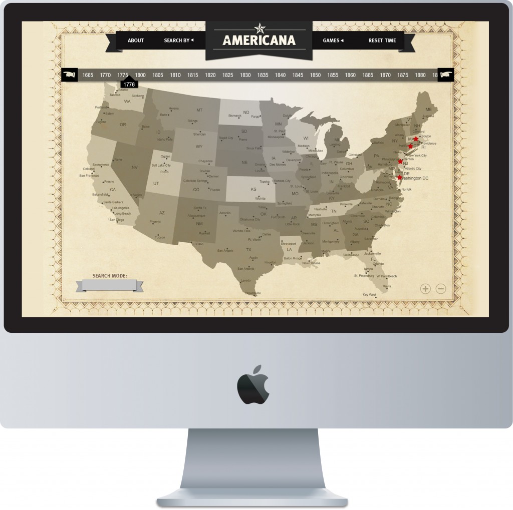
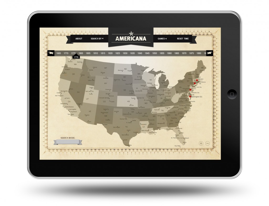
– It’s equipped with an interactive map, instead of someone typing in a certain theme on a browser and leafing through Wikipedia. Also includes a game.
TARGET AUDIENCE:
– Students. As young as 6th through High School.
THE BRANDING

DESIGN DESCRIPTION:
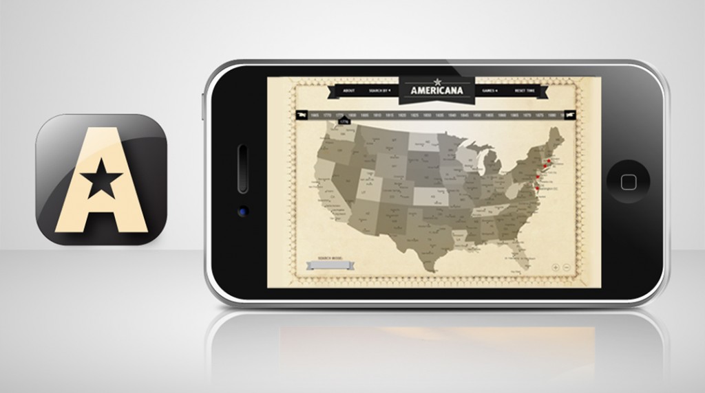
– Since the subject is history, I had wanted to keep that “antique” look and feel but yet still modern. Hence the use of aged paper and limited color just so the information would pop out.
CURRENT PLANS of ACTION:
-Trying to figure out how to scrape the information from Wikipedia in order to consolidate the information for this site. So far it hasn’t been easy.
Game design coming soon!
Hazel M. Bala
Well let's see... I graduated from NYU w/ a BA in French Language and International Politics. Because of the French, I became an account executive in the fashion industry. Being a corporate yuppie didn't really sit well with me after awhile. So I switched careers and retrained as a Graphic Designer/Art Director building up my print portfolio (I wanted to pay attention to my creative side).
Now in my 30s, I want to evolve into something more progressive along the lines of new media (i.e. interaction, web and motion). I've handled huge accounts, dealt with "captain of industry" types, and managed a staff. At this point, I want to focus on me and what I truly want to become professionally. I'm a lot more mature and honest with myself this time around. And I think I have more to offer artistically and intellectually than I had in the past.
Permanent link to this article: http://interface2011.coin-operated.com/2011/11/americana-interface-website/


Comments!